by Michael Alexander
Dashboards & Reports
FOR
by Michael Alexander
Dashboards & Reports
FOR
Hoboken, NJ 07030-5774
www.wiley.com
Copyright © 2008 by Wiley Publishing, Inc., Indianapolis, Indiana Published by Wiley Publishing, Inc., Indianapolis, Indiana Published simultaneously in Canada
No part of this publication may be reproduced, stored in a retrieval system or transmitted in any form or by any means, electronic, mechanical, photocopying, recording, scanning or otherwise, except as permit-ted under Sections 107 or 108 of the 1976 Unipermit-ted States Copyright Act, without either the prior written permission of the Publisher, or authorization through payment of the appropriate per-copy fee to the Copyright Clearance Center, 222 Rosewood Drive, Danvers, MA 01923, (978) 750-8400, fax (978) 646-8600. Requests to the Publisher for permission should be addressed to the Legal Department, Wiley Publishing, Inc., 10475 Crosspoint Blvd., Indianapolis, IN 46256, (317) 572-3447, fax (317) 572-4355, or online at
http://www.wiley.com/go/permissions.
Trademarks:Wiley, the Wiley Publishing logo, For Dummies, the Dummies Man logo, A Reference for the Rest of Us!, The Dummies Way, Dummies Daily, The Fun and Easy Way, Dummies.com, and related trade dress are trademarks or registered trademarks of John Wiley & Sons, Inc. and/or its affiliates in the United States and other countries, and may not be used without written permission. Microsoft and Excel are reg-istered trademarks of Microsoft Corporation in the United States and/or other countries. All other trade-marks are the property of their respective owners. Wiley Publishing, Inc., is not associated with any product or vendor mentioned in this book.
LIMIT OF LIABILITY/DISCLAIMER OF WARRANTY: THE PUBLISHER AND THE AUTHOR MAKE NO REP-RESENTATIONS OR WARRANTIES WITH RESPECT TO THE ACCURACY OR COMPLETENESS OF THE CONTENTS OF THIS WORK AND SPECIFICALLY DISCLAIM ALL WARRANTIES, INCLUDING WITHOUT LIMITATION WARRANTIES OF FITNESS FOR A PARTICULAR PURPOSE. NO WARRANTY MAY BE CRE-ATED OR EXTENDED BY SALES OR PROMOTIONAL MATERIALS. THE ADVICE AND STRATEGIES CON-TAINED HEREIN MAY NOT BE SUITABLE FOR EVERY SITUATION. THIS WORK IS SOLD WITH THE UNDERSTANDING THAT THE PUBLISHER IS NOT ENGAGED IN RENDERING LEGAL, ACCOUNTING, OR OTHER PROFESSIONAL SERVICES. IF PROFESSIONAL ASSISTANCE IS REQUIRED, THE SERVICES OF A COMPETENT PROFESSIONAL PERSON SHOULD BE SOUGHT. NEITHER THE PUBLISHER NOR THE AUTHOR SHALL BE LIABLE FOR DAMAGES ARISING HEREFROM. THE FACT THAT AN ORGANIZATION OR WEBSITE IS REFERRED TO IN THIS WORK AS A CITATION AND/OR A POTENTIAL SOURCE OF FUR-THER INFORMATION DOES NOT MEAN THAT THE AUTHOR OR THE PUBLISHER ENDORSES THE INFORMATION THE ORGANIZATION OR WEBSITE MAY PROVIDE OR RECOMMENDATIONS IT MAY MAKE. FURTHER, READERS SHOULD BE AWARE THAT INTERNET WEBSITES LISTED IN THIS WORK MAY HAVE CHANGED OR DISAPPEARED BETWEEN WHEN THIS WORK WAS WRITTEN AND WHEN IT IS READ.
For general information on our other products and services, please contact our Customer Care Department within the U.S. at 800-762-2974, outside the U.S. at 317-572-3993, or fax 317-572-4002. For technical support, please visit www.wiley.com/techsupport.
Wiley also publishes its books in a variety of electronic formats. Some content that appears in print may not be available in electronic books.
Library of Congress Control Number: 2008921207 ISBN: 978-0-470-22814-2
Michael Alexanderis a Microsoft Certified Application Developer (MCAD) with over 14 years experience consulting and developing office solutions. He is the author/co-author of several books on business analysis using Microsoft Excel and Access. Michael is one of 96 Microsoft Excel MVPs worldwide who has been recognized for his contributions to the Excel community. He is also the principal player behind DataPigTechnologies.com,a site that offers video tutorials to beginning and intermediate Excel and Access users. He currently lives in Frisco, Texas where he works as a Senior Program Manager for a top technology firm. Michael can be contacted at mike@datapig
For my family.
Author’s Acknowledgments
Some of the people who helped bring this book to market include the following:
Acquisitions, Editorial, and Media Development
Senior Project Editor:Christopher Morris
Executive Editor:Gregory S. Croy
Copy Editor:Jennifer Riggs
Technical Editor:Loren Abdulezer
Editorial Manager:Kevin Kirschner
Assistant Producer:Kit Malone
Media Development Coordinator:
Jenny Swisher
Editorial Assistant:Amanda Foxworth
Sr. Editorial Assistant:Cherie Case
Cartoons:Rich Tennant (www.the5thwave.com)
Composition Services
Project Coordinator: Katie Key
Layout and Graphics: Stacie Brooks, Reuben W. Davis, Alissa D. Ellet, Joyce Haughey, Christine Williams
Proofreader: Joni Heredia
Indexer: Potomac Indexing, LLC
Publishing and Editorial for Technology Dummies
Richard Swadley,Vice President and Executive Group Publisher
Andy Cummings,Vice President and Publisher
Mary Bednarek,Executive Acquisitions Director
Mary C. Corder,Editorial Director
Publishing for Consumer Dummies
Diane Graves Steele,Vice President and Publisher
Joyce Pepple,Acquisitions Director
Composition Services
Gerry Fahey,Vice President of Production Services
Introduction ...1
Part I: Making the Move to Dashboards...7
Chapter 1: Getting in the Dashboard State of Mind ...9
Chapter 2: Building a Super Model...23
Part II: Building Basic Dashboard Components ...49
Chapter 3: The Pivotal Pivot Table...51
Chapter 4: Excel Charts for the Uninitiated ...85
Chapter 5: The New World of Conditional Formatting ...109
Chapter 6: The Art of Dynamic Labeling ...135
Part III: Building Advanced Dashboard Components....151
Chapter 7: Components That Show Trending ...153
Chapter 8: Components That Group and Bucket Data ...177
Chapter 9: Components That Display Performance against a Target...195
Part IV: Advanced Reporting Techniques ...209
Chapter 10: Macro-Charged Reporting ...211
Chapter 11: Giving Users an Interactive Interface ...227
Part V: Working with the Outside World ...249
Chapter 12: Using External Data for Your Dashboards and Reports ...251
Chapter 13: Sharing Your Work with the Outside World ...265
Part VI: The Part of Tens ...279
Chapter 14: Ten Chart Design Principles ...281
Chapter 15: Ten Questions to Ask Before Distributing Your Dashboard ...293
Introduction...1
About This Book...2
Foolish Assumptions ...3
How This Book Is Organized...3
Part I: Making the Move to Dashboards ...4
Part II: Building Basic Dashboard Components ...4
Part III: Building Advanced Dashboard Components ...4
Part IV: Advanced Reporting Techniques ...5
Part V: Working with the Outside World ...5
Part VI: The Part of Tens ...5
Sample Files for This Book...5
Icons Used In This Book...6
Where to Go from Here...6
Part I: Making the Move to Dashboards ...7
Chapter 1: Getting in the Dashboard State of Mind . . . .9
Defining Dashboards and Reports ...10
Defining reports...10
Defining dashboards ...11
Preparing for Greatness ...12
Establish the audience and purpose for the dashboard ...12
Delineate the measures for the dashboard...13
Catalog the required data sources ...14
Define the dimensions and filters for the dashboard ...15
Determine the need for drill-down features...16
Establish the refresh schedule ...16
A Quick Look at Dashboard Design Principles...16
Rule number 1: Keep it simple...17
Use layout and placement to draw focus ...19
Format numbers effectively ...20
Chapter 2: Building a Super Model . . . .23
Data Modeling Best Practices...23
Separating data, analysis, and presentation ...24
Starting with appropriately structured data...27
Avoiding turning your data model into a database ...30
Using tabs to document and organize your data model ...31
Testing your data model before building reporting components on top of it...32
Excel Functions That Really Deliver ...33
The VLOOKUP function ...33
The HLOOKUP function...37
The SUMPRODUCT function ...39
The CHOOSE function...42
Using Smart Tables That Expand with Data ...44
Converting a range to an Excel table ...45
Converting an Excel table back to a range...47
Part II: Building Basic Dashboard Components...49
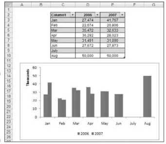
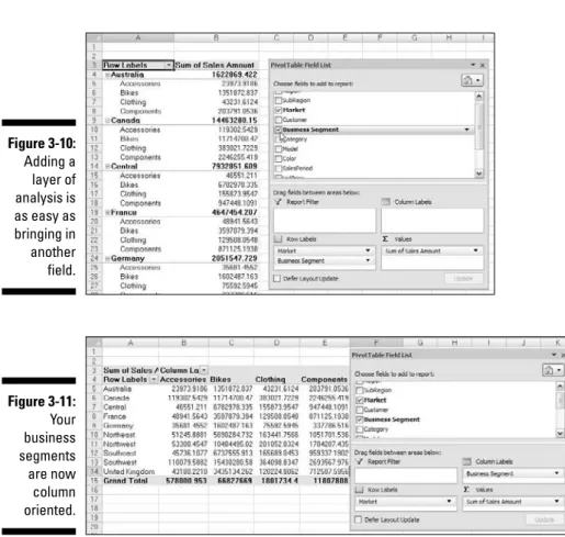
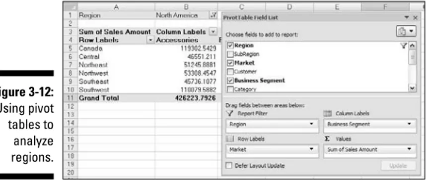
Chapter 3: The Pivotal Pivot Table . . . .51
An Introduction to the Pivot Table ...52
The Four Areas of a Pivot Table ...52
Values area ...52
Row area ...53
Column area ...54
Filter area...54
Creating Your First Pivot Table ...55
Changing and rearranging your pivot table ...58
Adding a report filter ...59
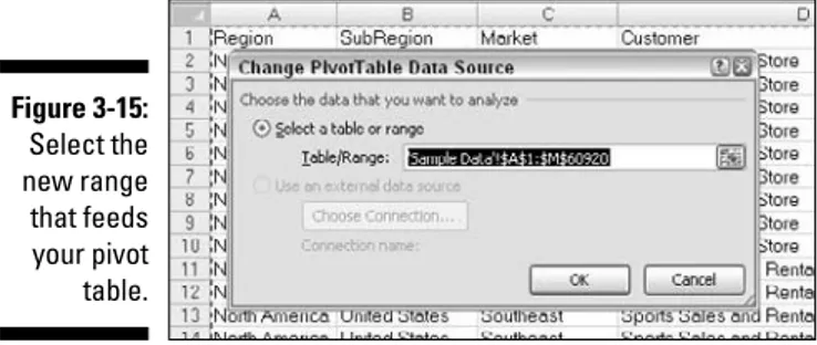
Keeping your pivot table fresh ...60
Customizing Your Pivot Table Reports ...62
Changing the pivot table layout ...62
Customizing field names ...63
Applying numeric formats to data fields...65
Changing summary calculations ...65
Suppressing subtotals...66
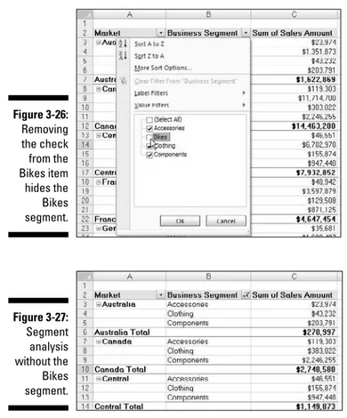
Showing and hiding data items...69
Hiding or showing items without data ...71
Sorting your pivot table...73
Creating Useful Pivot-Driven Views ...74
Producing top and bottom views ...74
Creating a percent distribution view ...80
Creating a YTD totals view ...81
Creating a month-over-month variance view...82
Chapter 4: Excel Charts for the Uninitiated . . . .85
Chart Building Basics ...85
A review of the most-commonly-used chart types ...86
Preparing data for different chart types...89
Creating a chart from scratch...92
Charting disparate data...93
Common Chart Tasks ...94
Resizing and moving charts ...94
Changing chart type...96
Creating a combination chart ...97
Selecting and formatting chart elements ...99
Working with Pivot Charts ...102
Pivot chart fundamentals ...102
Pivot charts and the x and y axes ...105
Pivot charts formatting limitations...107
Chapter 5: The New World of Conditional Formatting . . . .109
Applying Basic Conditional Formatting ...109
Highlight Cells Rules ...110
Top/Bottom Rules ...113
Data Bars, Color Scales, and Icon Sets ...116
Getting Fancy with Conditional Formatting...119
Adding your own formatting rules manually ...119
Showing only one icon...124
Showing Data Bars and icons outside cells ...126
Representing trends with Icon Sets ...129
Building a legend for your conditional formatting...131
Using conditional formatting with pivot tables...132
Chapter 6: The Art of Dynamic Labeling . . . .135
Creating a Basic Dynamic Label ...135
Adding Layers of Analysis with Dynamic Labels ...137
Excel’s Mysterious Camera Tool ...138
Finding the Camera tool ...139
The basics of using the Camera tool...140
Cool uses for the Camera tool ...141
Formula-Driven Visualizations ...144
In-cell charting without charts or conditional formatting ...144
Part III: Building Advanced Dashboard Components ....151
Chapter 7: Components That Show Trending . . . .153
Trending Dos and Don’ts...153
Using chart types appropriate for trending ...153
Starting the vertical scale at zero...155
Leveraging Excel’s logarithmic scale ...157
Applying creative label management...159
Comparative Trending...161
Creating side-by-side time comparisons ...161
Creating stacked time comparisons ...163
Trending with a secondary axis ...164
Highlighting Periods of Time ...167
Formatting specific periods ...167
Using dividers to mark significant events ...169
Representing forecasts in your trending components ...170
Other Trending Techniques...171
Avoiding overload with directional trending ...171
Smoothing data ...172
Catching sparkline fever...174
Chapter 8: Components That Group and Bucket Data . . . .177
Creating Top and Bottom Displays ...177
Incorporating top and bottom displays into dashboards...178
Using pivot tables to create interactive top and bottom views...179
Using Histograms to Track Relationships and Frequency...182
Creating formula-driven histograms ...183
Adding a cumulative percent to your histogram ...185
Creating a histogram with a pivot table ...188
Highlighting Top Values in Charts...190
Chapter 9: Components That Display Performance
against a Target . . . .195
Showing Performance with Variances ...195
Showing Performance against Organizational Trends ...196
Using Thermometer-Style Charts to Display Performance...198
An Introduction to the Bullet Graph...199
Creating your first bullet graph ...200
Adding data to your bullet graph ...203
Final thoughts on formatting bullet graphs ...204
Part IV: Advanced Reporting Techniques ...209
Chapter 10: Macro-Charged Reporting . . . .211
Why Use a Macro?...211
Introducing the Macro Recorder...212
The Macro Recorder user interface ...213
Recording macros with absolute references ...214
Recording macros with relative references ...217
Assigning a macro to a button ...219
Macro Security in Excel 2007...221
The short-term solution to disabled macros ...221
The long-term solution to disabled macros...222
Excel Macro Examples...223
Building navigation buttons...223
Dynamically rearranging pivot table data...224
Offering one-touch reporting options...225
Chapter 11: Giving Users an Interactive Interface . . . .227
Introducing Form Controls ...227
Adding and Configuring Controls...230
Using the Button Control ...231
Using the Check Box Control...232
Check Box Example: Toggling a Chart Series On and Off...233
Using Option Button Controls ...235
Option Button Example: Showing Many Views through One Chart ...237
Using the Combo Box Control ...238
Combo Box Example: Controlling Multiple Pivot Tables with One Combo Box ...240
Using the List Box Control ...244
List Box Example: Controlling Multiple Charts with One Selector ...245
Part V: Working with the Outside World...249
Chapter 12: Using External Data for Your Dashboards
and Reports . . . .251
Using the Get External Data Group ...252
Importing Access data with the Get External Data Group ...252
Importing SQL Server data with the Get External Data menu ...255
Using the MS Query Wizard ...258
Chapter 13: Sharing Your Work with the Outside World . . . .265
Protecting Your Dashboards and Reports ...265
Securing the entire workbook using file protection options ...266
Protecting worksheets ...268
Protecting the workbook structure...272
Linking Your Excel Dashboards into PowerPoint ...273
Creating the link between Excel and PowerPoint ...273
Manually refreshing links to capture updates ...275
Automatically refreshing links to capture updates...276
Distributing Your Dashboards via PDF...278
Part VI: The Part of Tens...279
Chapter 14: Ten Chart Design Principles . . . .281
Avoid Fancy Formatting ...282
Skip the Unnecessary Chart Junk ...283
Format Large Numbers Where Possible...285
Use Data Tables instead of Data Labels ...286
Make Effective Use of Chart Titles ...288
Sort Your Data before Charting ...288
Limit the Use of Pie Charts ...289
Don’t Be Afraid to Parse Data into Separate Charts ...290
Maintain Appropriate Aspect Ratios ...291
Don’t Be Afraid to Use Something Other Than a Chart...292
Chapter 15: Ten Questions to Ask Before Distributing
Your Dashboard . . . .293
Does My Dashboard Present the Right Information? ...293
Does Everything on My Dashboard Have a Purpose? ...294
Does My Dashboard Prominently Display the Key Message? ...294
Can I Maintain This Dashboard? ...295
Does My Dashboard Clearly Display Its Scope and Shelf Life? ...295
Is My Dashboard Well Documented? ...295
Is My Dashboard Overwhelmed with Formatting and Graphics? ...296
Does My Dashboard Overuse Charts When Tables Will Do?...297
Is My Dashboard User-Friendly? ...297
Is My Dashboard Accurate? ...298
T
he term business intelligence (BI),coined by Howard Dresner of the Gartner Group, describes the set of concepts and methods to improve business decision-making by using fact-based support systems. Practically speaking, BI is what you get when you analyze raw data and turn that analy-sis into knowledge. BI can help an organization identify cost-cutting opportu-nities, uncover new business opportuopportu-nities, recognize changing business environments, identify data anomalies, and create widely accessible reports, among other things.Over the last few years, the BI concept has overtaken corporate executives who are eager to turn impossible amounts of data into knowledge. As a result of this trend, whole industries have been created. Software vendors that focus on BI and dashboarding are coming out of the woodwork. New consult-ing firms toutconsult-ing their BI knowledge are poppconsult-ing up virtually every week. And even the traditional enterprise solution providers, like Business Objects and SAP, are offering new BI capabilities.
This need for BI has manifested itself in many forms. Most recently, it’s come in the form of dashboard fever. Dashboardsare reporting mechanisms that deliver business intelligence in a graphical form.
Maybe you’vebeen hit with dashboard fever. Or maybe your manager is hit-ting you with dashboard fever. Nevertheless, you’re probably holding this book because you’re being asked to create BI solutions (that is, dashboards) in Excel.
Although many IT (information technology) managers would scoff at the thought of using Excel as a BI tool, Excel is inherently part of the enterprise BI tool portfolio. Whether IT managers are keen to acknowledge it, most of the data analysis and reporting done in business today is done by using spreadsheets. Here are several significant reasons to use Excel as the plat-form for your dashboards and reports:
⻬Built-in flexibility:With most enterprise dashboarding solutions, the capability to perform analyses outside the predefined views is either dis-abled or unavailable. How many times have you dumped enterprise-level data into Excel so you can analyze it yourself? I know I have. You can bet that if you give users an inflexible reporting mechanism, they’ll do what it takes to create their own usable reports. In Excel, features, such as pivot tables, autofilters, and Form controls allow you to create mecha-nisms that don’t lock your audience into one view. And because you can have multiple worksheets in one workbook, you can give them space to do their own side analysis as needed.
⻬Rapid development:Building your own reporting capabilities in Excel can liberate you from the IT department’s resources and time limitations. With Excel, not only can you develop reporting mechanisms faster, but you have the flexibility to adapt more quickly to changing requirements.
⻬Powerful data connectivity and automation capabilities: Excel isn’t the toy application some IT managers make it out to be. With its own native programming language and its robust object model, Excel can be used to automate processes and even connect to various data sources. With a few advanced techniques, you can make Excel a hands-off reporting mechanism that practically runs on its own.
⻬Little to no incremental costs: Not all of us can work for multi-billion dollar companies that can afford enterprise-level reporting solutions. In most companies, funding for new computers and servers is limited, let alone funding for expensive BI reporting packages. For those companies, leveraging Microsoft Office is frankly the most cost-effective way to deliver key business reporting tools without compromising too deeply on usability and functionality.
All that being said, so many reporting functions and tools are in Excel that it’s difficult to know where to start. Enter your humble author, spirited into your hands via this book. Here, I show you how you can turn Excel into your own personal BI tool. With a few fundamentals and some of the new BI functional-ity Microsoft has included in this latest version of Excel, you can go from reporting data with simple tables to creating a meaningful reporting compo-nent that’s sure to wow management.
About This Book
It’s important to note that this book isn’t a guide to visualizations or dash-boarding best practices. Those are subjects worthy of their own book. This book focuses on understanding the technical aspects of using Excel’s various tools and functionality and applying them to reporting.
The chapters in this book are designed to be standalone chapters that you can selectively refer to as needed. As you move through this book, you can create increasingly sophisticated dashboard and report components. After reading this book, you can
⻬Analyze large amounts of data and report that data in a meaningful way.
⻬Get a better understanding of data by viewing it from different perspectives.
⻬Quickly slice data into various views on the fly.
⻬Automate redundant reporting and analyses.
⻬Create interactive reporting processes.
Foolish Assumptions
I make three assumptions about you as the reader, which are:
⻬You’ve already bought and installed Excel 2007.
⻬You have some familiarity with the basic concepts of data analysis, such as working with tables, aggregating data, and performing calculations.
⻬You have a strong grasp of basic Excel concepts, such as managing table structures, creating formulas, referencing cells, filtering, and sorting.
How This Book Is Organized
Part I: Making the Move to Dashboards
Part I is all about helping you think about your data in terms of creating effec-tive dashboards and reports. Chapter 1 introduces you to the topic of dash-boards and reports, giving you some of the fundamentals and basic ground rules for creating effective dashboards and reports. Chapter 2 shows you a few concepts around data structure and layout. In this chapter, I demonstrate the impact of a poorly-planned data set and show you the best practices for setting up the source data for your dashboards and reports.Part II: Building Basic
Dashboard Components
In Part II, you take an in-depth look at some of the basic dashboard compo-nents you can create using Excel 2007. This part begins with Chapter 3 where I introduce you to pivot tables and discuses how a pivot table can play an integral role in Excel-based dashboards. Chapter 4 provides a primer on building charts in Excel 2007, giving beginners a solid understanding of how Excel charts work. Chapter 5 introduces you to the new and improved condi-tional formatting funccondi-tionality found in Excel 2007. In this chapter, I present several ideas for using the new conditional formatting tools in dashboards and reports. In Chapter 6, you explore the various techniques that can be used to create dynamic labels, allowing for the creation of a whole new layer of visualization.
Part III: Building Advanced
Dashboard Components
Part IV: Advanced Reporting Techniques
Part IV focuses on techniques that help you automate your reporting processes and give your users an interactive user interface. Chapter 10 pro-vides a clear understanding of how macros can be leveraged to supercharge and automate your reporting systems. Chapter 11 illustrates how you can provide your clients with a simple interface, allowing them to easily navigate through and interact with their reporting systems.Part V: Working with the Outside World
The theme in Part V is importing and exporting information to and from Excel. Chapter 12 explores some of the ways to incorporate data that doesn’t originate in Excel. In this chapter, I show you how to import data from external sources as well as how to create systems that allow for dynamic refreshing of external data sources. Chapter 13 wraps up this look on Excel dashboards and reports by showing you the various ways to distrib-ute and present your work.Part VI: The Part of Tens
Part VI is the classic Part of Tens section found in almost all For Dummies
series titles. The chapters found here each present ten or more pearls of wisdom, delivered in bite-sized pieces. In Chapter 14, I share with you ten or so chart-building best practices, helping you design more effective charts. In Chapter 15, I provide a checklist of questions you should ask yourself before sharing your Excel dashboards and reports.
Sample Files for This Book
This book comes with samples files that can be downloaded from the Wiley Web site at the following URL:
Icons Used In This Book
Throughout this book, you may notice little icons in the left margin that act as road signs to help you quickly pull out the information that’s most impor-tant to you. Here’s what they look like and what they represent.
Information tagged with a Remember icon identifies general information and core concepts that you may already know but should certainly understand and review.
Tip icons include short suggestions and tidbits of useful information.
Look for Warning icons to identify potential pitfalls, including easily-confused or difficult-to-understand terms and concepts.
Technical Stuff icons highlight technical details that you can skip unless you want to bring out the tech geek in you.
Where to Go from Here
If you want to get an understanding of best practices and techniques to get started with a dashboarding project, start with Chapters 1 and 2.
If you’re looking for a quick tutorial on reporting data with pivot tables, Chapter 3 is what you need.
If you’re relatively new to Excel and you’re looking to get a sense of the basic reporting tools available in Excel, Chapters 4, 5 and 6 will get you started.
If you’re a bit more experienced and you’d like to discover some advanced techniques for reporting data and automating you dashboards, you can explore Chapters 7 through 11.
Working in an environment where you have to share your reporting with the outside world? Chapters 12 and 13 will show you how to use external data and some of the ways you can distribute your dashboards.
Getting in the Dashboard
State of Mind
In This Chapter
䊳Comparing dashboards to reports
䊳Getting started on the right foot
䊳Dashboarding best practices
I
n his song, “New York State of Mind,” Billy Joel laments the differences between California and New York. In this homage to the Big Apple, he implies a mood and a feeling that comes with thinking about New York. I admit it’s a stretch, but I’ll to extend this analogy to Excel — don’t laugh.In Excel, the differences between building a dashboard and creating standard table-driven analyses are as great as the differences between California and New York. To approach a dashboarding project, you truly have to get into the dashboard state of mind. As you’ll come to realize in the next few chapters, dashboarding requires far more preparation than standard Excel analyses. It calls for closer communication with business leaders, stricter data modeling techniques, and the following of certain best practices. It’s beneficial to have a base familiarity with fundamental dashboarding concepts before venturing off into the mechanics of building a dashboard.
Defining Dashboards and Reports
It isn’t difficult to use reportand dashboardinterchangeably. In fact, the line between reports and dashboards frequently gets muddied. I’ve seen count-less reports that have been referred to as dashboards just because they included a few charts. Likewise, I’ve seen many examples of what could be considered dashboards but have been called reports.
Now this may all seem like semantics to you, but it’s helpful to clear the air a bit and understand the core attributes of what are considered to be reports and dashboards.
Defining reports
Reports are probably the most common application of business intelligence. A reportcan be described as a document that contains data used for reading or viewing. It can be as simple as a data table or as complex as a subtotaled view with interactive drilling, similar to Excel’s Subtotal functionality.
The key attribute of a report is that it doesn’t lead a reader to a predefined conclusion. Although a report can include analysis, aggregations, and even charts, reports often allow for the end user to apply his own judgment and analysis to the data.
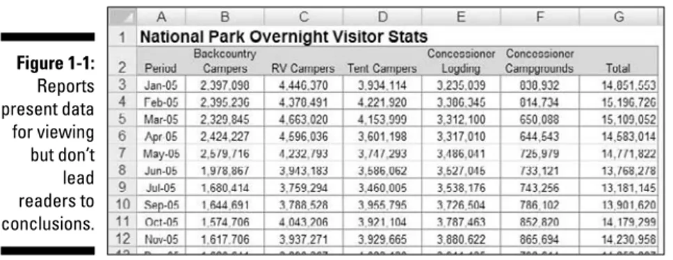
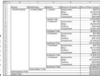
To clarify this concept, Figure 1-1 shows an example of a report. This report shows the National Park overnight visitor statistics by period. Although this data can be useful, it’s clear this report isn’t steering the reader in any predefined judgment or analysis; it’s simply presenting the aggregated data.
Figure 1-1:
Defining dashboards
A dashboardis a visual interface that provides at-a-glance views into key measures relevant to a particular objective or business process. Dashboards have three main attributes:
⻬Dashboards are typically graphical in nature, providing visualizations that help focus attention on key trends, comparisons, and exceptions.
⻬Dashboards often display only data that are relevant to the goal of the dashboard.
⻬Because dashboards are designed with a specific purpose or goal, they inherently contain predefined conclusions that relieve the end user from performing his own analysis.
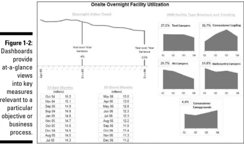
Figure 1-2 illustrates a dashboard that uses the same data shown in
Figure 1-1. This dashboard displays key information about the National Park overnight visitor stats. As you can see, this presentation has all the main attributes that define a dashboard. First, it’s a visual display that allows you to quickly recognize the overall trending of the overnight visitor stats. Second, you can see that not all the detailed data is shown here; only the key pieces of information that’s relevant to support the goal of this dashboard. Finally, by virtue of its objective, this dashboard effectively presents you with analysis and conclusions about the trending of overnight visitors.
Figure 1-2:
Dashboards provide at-a-glance
Preparing for Greatness
Imagine your manager asks you to create a dashboard that tells him everything he should know about monthly service subscriptions. Do you jump to action and slap together whatever comes to mind? Do you take a guess at what he wants to see and hope it’s useful? These questions sound ridiculous but such situations happen more that you think. I’m constantly called to action to create the next great reporting tool but am rarely provided the time to gather the true requirements for it. Between limited information and unrealistic deadlines, the end product often ends up being unused or having little value.
This brings me to one of the key steps in preparing for dashboarding — collecting user requirements.
In the non-IT world of the Excel analyst, user requirements are practically useless because of sudden changes in project scope, constantly changing pri-orities, and shifting deadlines. The gathering of user requirements is viewed to be a lot of work and a waste of valuable time in the ever-changing business environment. But as I mention at the start of this chapter, it’s time
to get into the dashboard state of mind.
Consider how many times a manager has asked you for an analysis and then said “No, I meant this.” Or, “Now that I see it, I realize I need this.” As frustrating as that can be for a single analysis, imagine running into this during the cre-ation of a complex dashboard with several data integrcre-ation processes. The question is, would you rather spend your time on the front end gathering user requirements or spend time painstakingly redesigning the dashboard you’ll surely come to hate?
The process of gathering user requirements doesn’t have to be an overly complicated or formal one. Here are some simple things you can do to ensure you have a solid idea of the purpose of the dashboard.
Establish the audience and
purpose for the dashboard
Chances are your manager has been asked to create the reporting mechanism, and he has passed the task to you. Don’t be afraid to clarify the source of the initial request and talk to them about what they’re really asking for. Discuss the purpose of the dashboard and the triggers that caused them to ask for a dash-board in the first place. You may find, after discussing the matter, that a simple Excel report meets their needs, foregoing the need for a full-on dashboard.
managers? Will the dashboard be used to share data with external customers? Talking through these fundamentals with the right people helps align your thoughts and avoids the creation of a dashboard that doesn’t fulfill the necessary requirements.
Delineate the measures for the dashboard
Most dashboards are designed around a set of measures, or key performance indicators (KPIs).A KPI is an indicator of the performance of a task deemed to be essential to daily operations or processes. The idea is that a KPI reveals performance that is outside the normal range for a particular measure, so it therefore often signals the need for attention and intervention. Although the measures you place into your dashboards may not officially be called KPIs, they undoubtedly serve the same purpose — to draw attention to problem areas.The topic of creating effective KPIs for your organization is a subject worthy of its own book and is out of the scope of this endeavor. For a detailed guide on KPI development strategies, pick up David Parmenter’s Key Performance Indicators: Developing, Implementing, and Using Winning KPIs(Wiley). This book provides an excellent step-by-step approach to developing and implementing KPIs.
The measures used on a dashboard should absolutely support the initial pur-pose of that dashboard. For example, if you’re creating a dashboard focused on supply chain processes, it may not make sense to have human resources headcount data incorporated. It’s generally a good practice to avoid inclusion of nice-to-know data into your dashboards simply to fill white space or because the data is available. If the data doesn’t support the core purpose of the dashboard, leave it out.
Here’s another tip: When gathering the measures required for the dashboard, I find that it often helps to write a sentence to describe the measure needed. For example, instead of simply adding the word Revenueinto my user require-ments, I write what I call a component question,such as, “What is the overall revenue trend for the last two years?” I call it a component questionbecause I intend to create a single component, such as a chart or a table, to answer the question. For instance, if the component question is, “What is the overall revenue trend for the last two years?,” you can imagine a chart component answering that question by showing the two-year revenue trend.
Each box in this dashboard layout mockup represents a component on the dashboard and its approximate position. The questions within each box provide a sense of the types of data required to create the measures for the dashboard.
Catalog the required data sources
When you have the list of measures that need to be included on the dash-board, it’s important to take a tally of the available systems to determine if the data required to produce those measures are available. Ask yourself the following questions:
⻬Do you have access to the data sources necessary?
⻬How often are those data sources refreshed?
⻬Who owns and maintains those data sources?
⻬What are the processes to get the data from those resources?
⻬Does the data even exist?
These are all questions you need answered when negotiating development time, refresh intervals, and phasing.
Conventional wisdom says that the measures on your dashboard shouldn’t be governed by the availability of data. Instead, you should let dashboard KPIs and measures govern the data sources in your organization. Although I agree with the spirit of that statement, I’ve been involved in too many dashboard projects that have fallen apart because of lack of data. Real-world experience has taught me the difference between the ideal and the ordeal.
If your organizational strategy requires that you collect and measure data that is nonexistent or not available, press pause on the dashboard project and turn your attention to creating a data collection mechanism that will get the data you need.
Define the dimensions and
filters for the dashboard
In the context of reporting, a dimensionis a data category used to organize business data. Examples of dimensions are Region, Market, Branch, Manager, or Employee. When you define a dimension in the user requirements stage of development, you’re determining how the measures should be grouped or distributed. For example, if it’s determined that your dashboard should report data by employee, you need to ensure that your data collection and aggregation processes include employee detail. As you can imagine, adding a new dimension after the dashboard is built can get complicated, especially when your processes require many aggregations across multiple data sources. The bottom line is that locking down the dimensions for a dash-board early in the process definitely saves you headaches.
Along those same lines, you want to get a clear sense of the types of filters that are required. In the context of dashboards, filtersare mechanisms that allow you to narrow the scope of the data to a single dimension. For example, you can filter on Year, Employee, or Region. Again, if you don’t account for a particular filter while building your dashboarding process, you’ll likely be forced into an unpleasant redesign of both your data collection processes and your dashboard.
Determine the need for drill-down features
Many dashboards provide drill-down featuresthat allow users to “drill” into the details of a specific measure. You want to get a clear understanding of the types of drill-downs your users have in mind.To most users, drill-down featuremeans the ability to get a raw data table supporting the measures shown on the dashboard. Although getting raw data isn’t always practical or possible, discussing these requests will at a mini-mum allow you to talk to your users about additional reporting, links to other data sources, and other solutions that may help them get the data they need.
Establish the refresh schedule
A refresh schedulerefers to the schedule by which a dashboard is updated to show the latest information available. Because you’re the one responsible for building and maintaining the dashboard, you should have a say in the refresh schedules. Your manager may not know what it takes to refresh the dashboard in question.
While you’re determining the refresh schedule, keep in mind the refresh rates of the different data sources whose measures you need to get. You can’t refresh your dashboard any faster than your data sources. Also, negotiate enough development time to build macros that aid in automation of redundant and time-consuming refresh tasks.
A Quick Look at Dashboard
Design Principles
When collecting user requirements for your dashboarding project, there’s a heavy focus on the data aspects of the dashboard: The types of data needed, the dimensions of data required, the data sources to be used, and so on. This is a good thing — without solid data processes, your dashboards won’t be effective or maintainable. That being said, here’s another aspect to your dashboarding project that calls for the same fervor in preparation: the
design aspect.
The good news is that dashboarding has been around for such a long time, there’s a vast knowledge base of prescribed visualization and dashboard design principles. Many of these principles seem like common sense; even so, these are concepts that Excel users don’t often find themselves thinking about. Because this chapter is about getting into the dashboard state of mind, I break that trend and review a few dashboard design principles that improve the design aspect of your Excel dashboards.
Many of the concepts in this section come from the work of Stephen Few,
visualization expert and author of several books and articles on dashboard design principles. As this book is primarily focused on the technical aspects of building reporting components in Excel, this section offers a high-level look at dashboard design. If you find that you’re captivated by the subject, feel free to visit Stephen Few’s Web site at www.perceptualedge.com.
Rule number 1: Keep it simple
Dashboard design expert, Stephen Few, has the mantra, “Simplify, Simplify, Simplify.” The basic idea is that dashboards cluttered with too many measures or too much eye candy can dilute the significant information you’re trying to present. How many times has someone told you that your reports look “busy”? In essence, this complaint means that too much is going on in the page or screen, making it hard to see the actual data.
Here are a few actions you can take to ensure simpler and more effective dashboard designs.
Don’t turn your dashboard into a data repository
Admit it. You include as much information onto a report as possible, primarily to avoid being asked for additional information. We all do it. But in the dash-board state of mind, you have to fight the urge to force every piece of data available onto your dashboards.
Overwhelming users with too much data can cause them to lose sight of the primary goal of the dashboard and focus on inconsequential data. The measures used on a dashboard should support the initial purpose of that dashboard. Avoid the urge to fill white space for the sake of symmetry and appearances. Don’t include nice-to-know data just because the data is available. If the data doesn’t support the core purpose of the dashboard, leave it out.
Avoid the fancy formatting
or formatting. You’ll find that the lack of fancy formatting only serves to call attention to the actual data. Focus on the data and not the shiny happy graphics. Here are a few guidelines:
⻬Avoid using colors or background fills to partition your dashboards. Colors in general should be used sparingly, reserved for providing infor-mation about key data points. For example, assigning the colors red, yellow, and green to measures traditionally indicates performance level. Adding these colors to other sections of your dashboard only serves to distract your audience.
⻬De-emphasize borders, backgrounds, and other elements that define dashboard areas.Try to use the natural white space between your com-ponents to partition your dashboard. If borders are necessary, format them to hues lighter than the ones you’ve used for your data. Light grays are typically ideal for borders. The idea is to indicate sections without distracting from the information displayed.
⻬Avoid applying fancy effects, such as gradients, pattern fills, shadows, glows, soft edges, and other formatting.Excel 2007 makes it easy to apply effects that make everything look shiny, glittery, and generally happy. Although these formatting features make for great marketing tools, they don’t do your reporting mechanisms any favors.
⻬Don’t try to enhance your dashboards with clip art or pictures.Not only do they do nothing to further data presentation, they often just look tacky.
Limit each dashboard to one printable page
Dashboards in general should provide at-a-glance views into key measures relevant to particular objectives or business processes. This implies that all the data is immediately viewable on the one page. Although including all your data on one page isn’t always the easiest thing to do, there’s much benefit to being able to see everything on one page or screen. You can compare sections more easily, you can process cause and effect relationships more effectively, and you rely less on short term memory. When a user has to scroll left, right, or down, these benefits are diminished. Furthermore, users tend to believe that when information is placed out of normal view (areas that require scrolling), it’s somehow less important.
Use layout and placement to draw focus
As I discuss earlier in this chapter, only measures that support the dash-board’s utility and purpose should be included in the dashboard. However, it should be said that just because all measures on your dashboard are signifi-cant, they may not always have the same level of importance. In other words, you’ll frequently want one component of your dashboard to stand out from the others.Instead of using bright colors or exaggerated sizing differences, you can lever-age location and placement to draw focus to the most important components on your dashboard.
Various studies have shown that readers have a natural tendency to focus on particular regions of a document. For example, researchers at the Poynter Institute’s Eyetracker III project have found that readers view various regions on a screen in a certain order, paying particular attention to specific regions on the screen. They use the diagram in Figure 1-4 to illustrate what they call priority zones.Regions with the number 1 in the diagram seem to have high prominence, attracting the most attention for longer periods of time. Meanwhile, priority 3 regions seem to have low prominence.
1
1
1
1
2
3
2
2
2
2
3
3
2
3
3
3
Figure 1-4:
You can leverage these priority zones to promote or demote certain compo-nents based on significance. If one of the charts on your dashboard warrants special focus, you can simply place that chart in a region of prominence.
Note that surrounding colors, borders, fonts, and other formatting can affect the viewing patterns of your readers, de-emphasizing a previously high prominence region.
Format numbers effectively
There will undoubtedly be lots of numbers in your dashboards. Some of them will be in charts, and others will be in tables. Remember that every piece of information on your dashboard should have a reason for being there. It’s important that you format your numbers effectively to allow your users to understand the information they represent without confusion or hindrance. Here are some guidelines to keep in mind when formatting the numbers in your dashboards and reports:
⻬Always use commas to make numbers easier to read.For example, instead of 2345, show 2,345.
⻬Only use decimal places if that level of precision is required.For instance, there’s rarely benefit for showing the decimal places in a dollar amount, such as $123.45. Likewise in percentages, use only the minimum number of decimals required to represent the data effectively. For example instead of 43.21%, you may be able to get away with 43%.
⻬Only use the dollar symbol when you need to clarify that you’re referring to monetary values.If you have a chart or table that contains all revenue values, and there’s a label clearly stating this, you can save rooms and pixels by leaving out the dollar symbol.
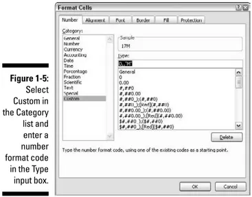
⻬Format very large numbers to the thousands or millions place.For instance, instead of displaying 16,906,714, you can format the number to read 17M.
Table 1-1 lists some common format codes and how they affect numbers.
Table 1-1
Number Format Codes
Number Format Code How 16,906,714 Would be Displayed0, 16907
0,0, 16,907
0.00, 16,906.71
0,”K” 16907K
0,0,”K” 16,907K
0.00,”K” 16,906.71K
$0,0,”K” $16,907K
0,, 17
0,,”M” 17M
0.0,,”M” 16.9M
0.00,,”M” 16.91M
$0.0,,”M” $16.9M
Figure 1-5:
Use titles and labels effectively
It’s common sense, but many people often fail to label items on dashboards effectively. If your manager looks at your dashboard and asks you, “What is this telling me?,” you likely have labeling issues. Here are a few guidelines for effective labeling in your dashboards and reports:
⻬Always include a timestamp on your reporting mechanisms.This minimizes confusion when distributing the same dashboard or report in monthly or weekly installments.
⻬Always include some text indicating when the data for the measures was retrieved.In many cases, timing of the data is a critical piece of information when analyzing a measure.
⻬Use descriptive titles for each component in your dashboard.This allows users to clearly identify what they’re looking at. Be sure to avoid cryptic titles with lots of acronyms and symbols.
Building a Super Model
In This Chapter
䊳Understanding the best data modeling practices
䊳Leveraging Excel functions to deliver data
䊳Creating smart tables that expand with data
O
ne of Excel’s most attractive features is its flexibility. You can create an intricate system of interlocking calculations, linked cells, and formatted summaries that work together to create a final analysis. However, years of experience has brought me face-to-face with an ugly truth. Although Excel is like the cool gym teacher that lets you do anything you want, a lack of struc-ture in your data models can lead to some serious headaches in the long run.What’s a data model? A data modelprovides the foundation upon which your reporting mechanism is built. When you build a spreadsheet that imports, aggregates, and shapes data, you’re essentially building a data model that feeds your dashboards and reports.
Creating a poorly-designed data model can mean hours of manual labor main-taining and refreshing your reporting mechanisms. On the other hand, creat-ing an effective model allows you to easily repeat monthly reportcreat-ing processes without damaging your reports or your sanity.
The goal of this chapter is to show you the concepts and techniques that help you build effective data models. In this chapter, you discover that creating a successful reporting mechanism requires more than slapping data onto a spreadsheet. Although you’ll see how to build cool dashboard components in later chapters, those components won’t do you any good if you can’t effec-tively manage your data models. On that note, let’s get started.
Data Modeling Best Practices
behind a reporting process. If they think about it at all, they usually start by imagining a mockup of the finished dashboard and work backward from there.
Instead of seeing just the finished dashboard in your head, try to think of the end-to-end process. Where will you get the data? How should the data be structured? What analysis will need to be performed? How will the data be fed to the dashboard? How will the dashboard be refreshed?
Obviously the answers to these questions are highly situation-specific. How-ever, some data modeling best practices will guide you to a new way of think-ing about your reportthink-ing process. These are discussed in the next few sections.
Separating data, analysis,
and presentation
One of the most important concepts in a data model is the separation of data, analysis, and presentation. The fundamental idea is that you don’t want your data to become too tied into any one particular way of presenting that data.
To get your mind around this concept, think about an invoice. When you receive an invoice, you don’t assume the financial data on that invoice is the true source of your data. It’s merely a presentation of data that’s actually stored in some database. That data can be analyzed and presented to you in many other manners: in charts, in tables, or even on Web sites. This sounds obvious, but Excel users often fuse data, analysis, and presentation together.
For instance, I’ve seen Excel workbooks that contain 12 tabs, each represent-ing a month. On each tab, data for that month is listed along with formulas, pivot tables, and summaries. Now what happens when you’re asked to pro-vide summary by quarter? Do you add more formulas and tabs to consolidate the data on each of the month tabs? The fundamental problem in this sce-nario is that the tabs actually represent data values that are fused into the presentation of your analysis.
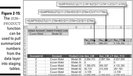
The alternative is to create three layers in your data model: a data layer, an analysis layer, and a presentation layer. You can think of these layers as three different spreadsheets in an Excel workbook. One sheet to hold the raw data that feeds your report, one sheet to serve as a staging area where the data is analyzed and shaped, and one to serve as the presentation layer. Figure 2-2 illustrates the three layers of an effective data model.
As you can see in Figure 2-2, the raw dataset is located on its own sheet. Although the dataset has some level of aggregation applied to keep it manageably small, no further analysis is done on the data sheet.
The analysis layer consists primarily of formulas that analyze and pull data from the data layer into formatted tables (commonly referred to as staging tables). These staging tables ultimately feed the reporting components in your presentation layer. In short, the sheet that contains the analysis layer becomes the staging area where data is summarized and shaped to feed the reporting components. Notice in the analysis tab in Figure 2-2, the formula bar illustrates that the table consists of formulas that reference the data tab.
There are a couple of benefits to this setup. First, the entire reporting model can easily be refreshed by simply replacing the raw data with an updated dataset. The formulas in the analysis tab continue to work with the latest data. Second, any additional analysis can easily be created by using different combinations of formulas on the analysis tab. If you need data that doesn’t exist in the data sheet, you can easily append a column to the end of the raw dataset without disturbing the analysis or presentation sheets.
Note that you don’t necessarily have to place your data, analysis, and presen-tation layers on different spreadsheets. In small data models, you may find it easier to place your data in one area of a spreadsheet while building your staging tables in another area of the same spreadsheet.
Figure 2-1:
Along those same lines, remember that you’re not limited to just three spread-sheets either. That is to say you can have several spread-sheets that provide the raw data, several sheets that analyze, and several that serve as the presentation layer.
Wherever you choose to place the different layers, keep in mind that the idea remains the same. The analysis layer should primarily consist of formulas that pull data from the data sheets into staging tables used to feed your pre-sentation. Later in this chapter, you explore some of the formulas that can be used in your analysis sheets.
Data
Analysis
Presentation
Figure 2-2:
Starting with appropriately structured data
Not all datasets are created equal. Although some datasets work in a standard Excel environment, they may not work for data modeling purposes. Before building your data model, ensure your source data is appropriately structured for dashboarding purposes.At the risk of oversimplification, I assert that datasets typically used in Excel come in three fundamental forms:
⻬The spreadsheet report
⻬The flat data file
⻬The tabular dataset
The punch line is that only flat data files and tabular datasets make for effec-tive data models. I review and discuss each of these different forms in the next few sections.
Spreadsheet reports make for ineffective data models
Spreadsheet reportsdisplay highly-formatted, summarized data and are often designed as presentation tools for management or executive users. A typical spreadsheet report makes judicious use of empty space for formatting, repeats data for aesthetic purposes, and presents only high level analysis. Figure 2-3 illustrates what I mean by spreadsheet report.
Figure 2-3:
Although a spreadsheet report may look nice, it doesn’t make for an effective data model. Why? The primary reason is that these reports offer you no sepa-ration of data, analysis, and presentation. You’re essentially locked into one analysis.
Although you could make charts from the report shown in Figure 2-3, it’d be impractical to apply any analysis outside what’s already there. For instance, how would you calculate and present the average of all bike sales? How would you calculate a list of the top ten best performing markets?
With this setup, you’re forced into very manual processes that are difficult to maintain month after month. Any analysis outside the high-level ones already in the report is basic at best — even with fancy formulas. Furthermore, what happens when you’re required to show bike sales by month? When your data model requires analysis with data that isn’t in the spreadsheet report, you’re forced to search for another dataset.
Flat data files lend themselves nicely to data models
The next type of file format is flat file. Flat filesare data repositories organized by row and column. Each row corresponds to a set of data elements, or a
record.Each column is a field.A field corresponds to a unique data element in record. Figure 2-4 contains the same data as the report in Figure 2-3 but is in flat data file format.
Notice that every data field has a column, and every column corresponds to one data element. Furthermore, there’s no extra spacing, and each row (or record) corresponds to a unique set of information. But the key attribute that makes this a flat file is that no single field uniquely identifies a record. In fact, you’d have to specify four separate fields (Region, Market, Business Segment, and a month’s sales amount) before you could uniquely identify the record.
Flat files lend themselves nicely to data modeling in Excel because they can be detailed enough to hold the data you need and still be conducive to a wide array of analysis with simple formulas — SUM, AVERAGE, VLOOKUP, and SUMIF, just to name a few. Later in this chapter, you explore formulas that come in handy in a reporting data model.
Figure 2-4:
Tabular datasets are perfect for pivot table driven data models
Many effective data models are driven primarily by pivot tables. Pivot tables (which I cover in Chapter 3) are Excel’s premier analysis tools. For those of you who have used pivot tables before, you know they offer an excellent way to summarize and shape data for use by reporting components, such as charts and tables.Tabular datasetsare ideal for pivot table driven data models. Figure 2-5 illus-trates a tabular dataset. Note that the primary difference between a tabular dataset, as shown in Figure 2-5, and a flat data file is that the column labels don’t double as actual data. For instance, in Figure 2-4, the month identifiers are integrated into the column labels. In Figure 2-5, the Sales Period column contains the month identifier. This subtle difference in structure is what makes tabular datasets optimal data sources for pivot tables. This structure ensures that key pivot table functions, such as sorting and grouping, work the way they should.
The attributes of a tabular dataset are as follows:
⻬The first row of the dataset contains field labels that describe the infor-mation in each column.
⻬The column labels don’t pull double-duty as data items that can be used as filters or query criterion (such as months, dates, years, regions, mar-kets, and so on).
⻬There are no blank rows or columns — every column has a heading, and a value is in every row.
⻬Each column represents a unique category of data.
⻬Each row represents individual items in each column.
Figure 2-5:
Avoiding turning your data
model into a database
In Chapter 1, you might have read that measures used on a dashboard should absolutely support the initial purpose of that dashboard. The same concept applies to the backend data model. You should only import data that’s neces-sary to fulfill the purpose of your dashboard or report.
In an effort to have as much data as possible at their fingertips, many Excel users bring into their spreadsheets every piece of data they can get their hands on. You can spot these people by the 40 megabyte files they send through e-mail. You’ve seen these spreadsheets — two tabs that contain presentation and then six hidden tabs that contain thousands of lines of data (most of which isn’t used). They essentially build a database in their spreadsheet.
What’s wrong with utilizing as much data as possible? Well, here are a few issues:
⻬Aggregating data within Excel increases the number of formulas. If you’re bringing in all raw data, you have to aggregate that data in Excel. This inevitably causes you to exponentially increase the number of for-mulas you have to employ and maintain. Remember that your data model is a vehicle for presenting analyses, not processing raw data. The data that works best in reporting mechanisms is what’s already been aggre-gated and summarized into useful views that can be naviaggre-gated and fed to dashboard components. Importing data that’s already been aggregated as much as possible is far better. For example, if you need to report on Revenue by Region and Month, there’s no need to import sales transac-tions into your data model. Instead, use an aggregated table consisting of Region, Month, and Sum of Revenue.
⻬Large datasets can cause difficulty in scalability.Imagine that you’re working in a small company and you’re using monthly transactions in your data model. Each month holds 80,000 lines of data. As time goes on, you build a robust process complete with all the formulas, pivot tables, and macros you need to analyze the data that’s stored in your neatly maintained tab. Now what happens after one year? Do you start a new tab? How do you analyze two datasets on two different tabs as one entity? Are your formulas still good? Do you have to write new macros?
These are all issues that can be avoided by importing only aggregated and summarized data that’s useful to the core purpose of your reporting needs.
Using tabs to document and
organize your data model
Wanting to keep your data model limited to one worksheet tab is natural. In my mind, keeping track of one tab is much simpler than using different tabs. However, limiting your data model to one tab has its drawbacks, including the following:
⻬Using one tab typically places limits on your analysis.Because only so many datasets can fit on a tab, using one tab limits the number of analy-ses that can be represented in your data model. This in turn limits the analysis your dashboard can offer. Consider adding tabs to your data model to provide additional data and analysis that may not fit on just one tab.
⻬Too much on one tab makes for a confusing data model.When working with large datasets, you need plenty of staging tables to aggregate and shape the raw data so that it can be fed to your reporting components. If you use only one tab, you’re forced to position these staging tables below or to the right of your datasets. Although this may provide all the elements needed to feed your presentation layer, a good deal of scrolling is necessary to view all the elements positioned in a wide range of areas. This makes the data model difficult to understand and maintain. Use separate tabs to hold your analysis and staging tables, particularly in data models that contain large datasets occupying a lot of real estate.
tab to your data model. The model map tab essentially summarizes the key ranges in the data model and allows you to document how each range interacts with the reporting components in the final presentation layer. As you can see in Figure 2-6, the model map is nothing fancy; just a table that lists some key information about each range in the model.
You can include any information you think appropriate in your model map. The idea is to give yourself a handy reference that guides you through the elements in your data model.
Testing your data model before building
reporting components on top of it
This best practice is simple. Make sure your data model does what it’s sup-posed to do before building dashboard components on top of it. In that vein, here are a few things to watch for:
⻬Test your formulas to ensure they’re working properly:Make sure your formulas don’t produce errors and that each formula outputs expected results.
⻬Double-check your main dataset to ensure it’s complete:Check that your data table has not truncated when transferring to Excel. Also, be sure that each column of data is present with appropriate data labels.
⻬Make sure all numeric formatting is appropriate:Be sure that the for-matting of your data is appropriate for the field. For example, check to see that dates are formatted as dates, currency values are formatted properly, and that the correct number of decimal places are displayed where needed.
The obvious goal here is to eliminate easily avoidable errors that may cause complications later.
Figure 2-6:
Excel Functions That Really Deliver
As you discover in this chapter, the optimal data model for any reporting mechanism is one where data, analysis, and presentation is separated into three layers. Although all three layers are important, the analysis layer is where the real art comes into play. The fundamental task of the analysis layer is to pull information from the data layer and then create staging tables that feed your charts, tables, and other reporting components. To do this effec-tively, you need to employ formulas that serve as data delivery mechanisms — formulas that deliver data to a destination range.
You see, the information you need lives in your data layer (typically a table containing aggregated data). Data delivery formulasare designed to get that data and deliver it to the analysis layer so it can be analyzed and shaped. The cool thing is that after you’ve set up you data delivery formulas, your analy-sis layer automatically updates each time your data layer is refreshed.
Confused? Don’t worry — in this section, I show you a few Excel functions that work particularly well in data delivery formulas. As you go through the examples here, you’ll start to see how these concepts come together.
The VLOOKUP function
The VLOOKUPfunction is the king of all lookup functions in Excel. I’d be will-ing to bet you’ve at least heard of VLOOKUP, if not used it a few times yourself.
Speaking of documenting your data model . . . .
Another way to document the logic in your data model is to use comments and labels liberally. It’s amazing how a few explanatory comments and labels can help clarify your spreadsheets. The general idea here is that the logic in your model should be clear to you even after you’ve been away from your data model for a long period of time.
Also, consider using colors to identify the ranges in your data model. Using colors in your data model enables you to quickly look at a range of cells and get a basic indication of what that range does. The general concept behind
this best practice is that each color represents a range type. For example, you could use yellow to represent staging tables used to feed the charts and the tables in your presentation layer. You could use gray to represent formulas that aren’t to be altered or touched, or purple to rep-resent reference tables used for lookups and drop-down lists.
The purpose of VLOOKUPis to find a specific value from a column of data where the leftmost row value matches a given criterion.
VLOOKUP basics
Take a look a Figure 2-7 to get the general idea. The table on the left shows sales by month and product number. The table on the right translates those product numbers to actual product names. The VLOOKUPfunction can help in associating the appropriate name to each respective product number.
To understand how VLOOKUPformulas work, take a moment to review the basic syntax. A VLOOKUPformula requires four arguments:
VLOOKUP(Lookup_value, Table_array, Col_index_num,
Range_lookup)
Lookup_value:The Lookup_valueargument identifies the value being looked up. This is the value that needs to be matched to the lookup table. In the example in Figure 2-7, the Lookup_valueis the product number. Therefore the first argument for all the formulas shown in Figure 2-7 refer-ence column C (the column that contains the product number).
Table_array:The Table_arrayargument specifies the range that con-tains the lookup values. In Figure 2-7, that range is G2:H8. Here are a couple points to keep in mind with this argument. First, for a VLOOKUPto work, the leftmost column of the table must be the matching value. For instance,
Figure 2-7:
In this example, the
VLOOKUP
function helps to look up the appropriate product names for each